Is Arial actually an easy-to-read typeface?
Comparisons often present text in different typefaces at the same point size to readers, and then measure legibility. However, at a constant point size, Arial is simply not the same size as Times New Roman, so that’s not a useful comparison. In the computer age, what does it matter if the notional “slug size” of the mechanical type would be the same?
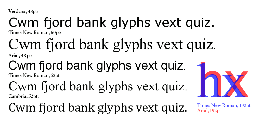
Sans serif fonts (like Arial and Helvetica) commonly have significantly-bigger optical sizes (a.k.a. “appearing size”, in typographic jargon) and stroke widths than their serif siblings (like Times New Roman and Matthew Butterick’s Equity), at the same point sizes. This becomes even more obvious with larger sizes. Try overlaying text at a large point size, like 192: at the same size, Times New Roman is obviously smaller and spindlier than Arial.
Is it any surprise that bigger, bolder letters might be more legible?
Same-point-size comparisons commonly conflate optical size of characters, stroke widths, and other factors, in addition to the choice of typefaces, making it impossible for such studies to confirm which of those factors makes what impact on legibility. Please let me know of any better empirical comparisons.
Mechanical type made it impractical to quickly change font sizes across a document, but computers make that easy.
Maybe 13- or 14-point bold Times New Roman is a better choice for “easy to read” than 12-point Arial, having a similar optical size but with visual cues that the sans serif typeface lacks? Rather than results from an apples-to-oranges comparison like 12-point Times New Roman to 12-point Arial, better comparisons would be more helpful toward designing better, more accessible documents.
Illustration of Apparent Sizes of Typefaces


